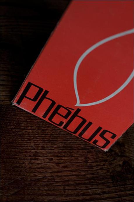
I found this old Phébus candles box…
Phébus seems to be a famous french candles brand at the begining on the XXth century. I couldn’t find anything about the brand today, but it seems to be part of Bougies la Française (investigation needed).
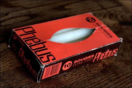
The box itself seems to have been printed during the early 80s (due to presence of a barcode). I consider this design as a mix of the 60s and 70s style.
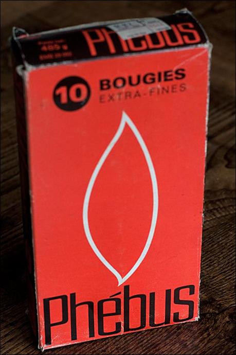
Using the Univers font (released in 1957 and very popular during the 60s and the 70s) for the words « bougies, extra-fines » and a derivative (or a redraw) of the Eurostile font (created in 1962) for the brand itself, the design is very pure (see the drawing of the candle flame), all reminds me the swiss graphic design of the 60s.
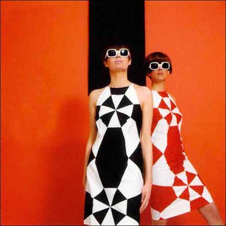
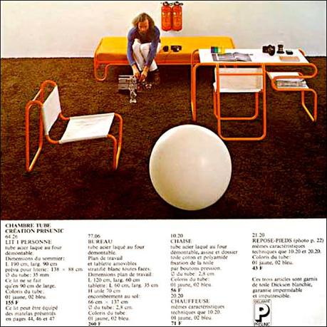
The wild-orange & brown color combination is typically 70s, reminds me the Denise Fayolle et Maïmé Arnodin designs for french store Prisunic (see below).
Billets en relation:
