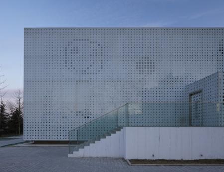
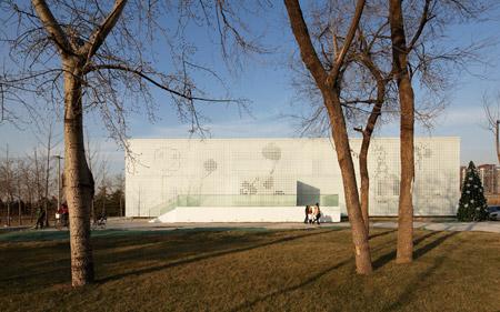
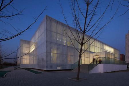
Situé à Pékin, ce bâtiment à la fois crèche et espace de loisirs a été imaginé par l’agence Crossboundaries Architects. Derrière une façade perforée reprenant le tracé de dessins d’enfants, il accueille les familles, jouant sur des échelles et des codes graphiques s’adressant aux petits et aux grands.

Sur ce projet, Crossboundaries Architects précise:
» “We have learned that to raise a happy, healthy and hopeful child, it takes a family, it takes teachers, it takes clergy, it takes business people, it takes community leaders, it takes those who protect our health and safety, it takes all of us.
Yes, it takes a village to raise a child.”
Hillary Clinton
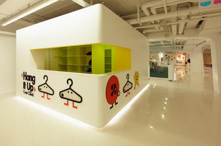
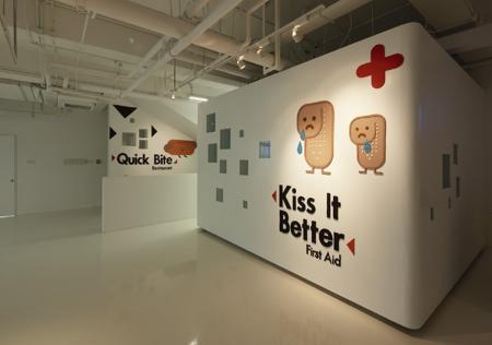
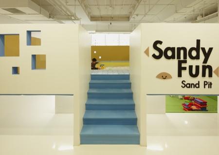
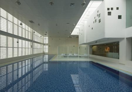
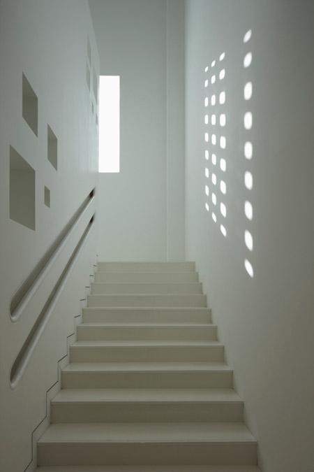
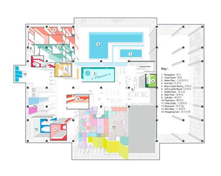
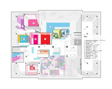
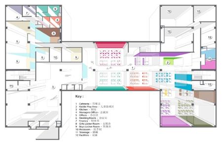
Family Box is something between a playground and a kindergarten, being used both by children ad adults. It hosts different kinds of activities, from swimming, playing games to various classes ranging from music and crafting to cooking. Further more there is a big playframe, a bookshop and a generous café area.
The different size and height between adult and child was the starting point for considering Family Box should be made by two types of spaces: a kids-scale space and an adult-scale space. How to find an inspiring balance between them? How to combine the different needs?
Despite the complex program another challenging part of this project was to deal with an existing structural system and column grid and also the building footprint – due to the involvement of another design firm in an earlier project stage. The rigid concrete structure of the building did not seem the most suitable for our purpose, so we decided to counterbalance that in different ways.
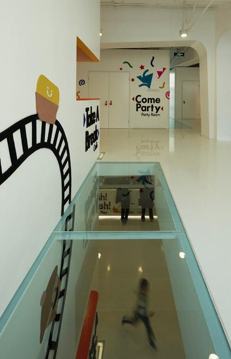
When we entered the design process, the two upper floors where not yet constructed – an opportunity for us to make the building more kids’ friendly: we decided to shift floor plates up and down and also cut out the floor in some areas to allow views between the floors.
The various activities are enclosed in freestanding boxes: this allows them to run parallel and it offers the most suitable environment for each. Their layout is meant to break the rigid layout of the concrete columns, which is also camouflaged with a series of arches that give a different rhythm to the environment.Visually, the common areas are treated with low contrast finishes in order to enhance and balance the space and equipments for the children.
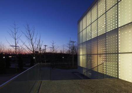
The glass facade has a printed pattern. The graphic motif is reversed: the background is translucent and the drawing is transparent.
The surrounding landscape is designed using pre-fabricated concrete tiles. Their displacement follows the facade grid creating a continuity between vertical and horizontal surfaces and merging smoothly the access path to the park. They do not follow a flat surface, since placed on a hilly ground. »
Pour en savoir plus, visitez le site de Crossboundaries Architects.
Family Box par Crossboundaries Architects is a post from: Muuuz - Blog Architecture, Design, Tendances, Inspiration

