Minimalism has been a popular website design style for years. It has so many benefits; minimalist sites load faster, take fewer server resources, and are often faster to develop than more graphically complicated designs. Plus, they give a professional, clean impression to visitors.
Many people still view minimalist designs as boring. But there’s a real art to effective minimal website designs, something not all designers can effectively master. When you limit the number of graphic elements you use and put the focus on negative space and typography, a good eye for spacing and proportion becomes crucial.
Below are more than 100 excellent examples of clean, simple and minimalist website designs. They run the gamut from simple brochure-style sites to ecommerce and portfolio sites. What they all have in common is a design aesthetic where less is more.
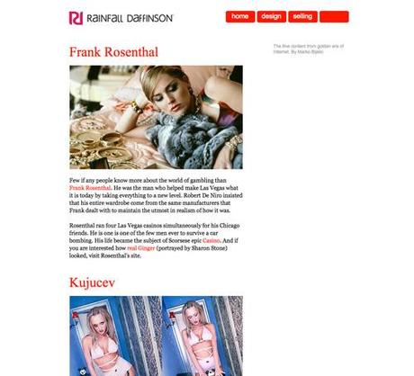
Rainfall Daffinson
A white background with red accents.
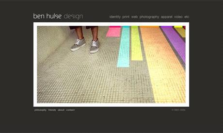
Ben Hulse Design
Dark gray background with white and gray lettering.
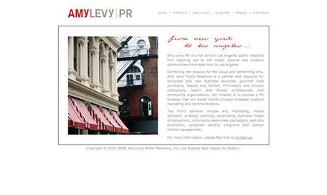
Amy Levy PR
White background with gray and red lettering.
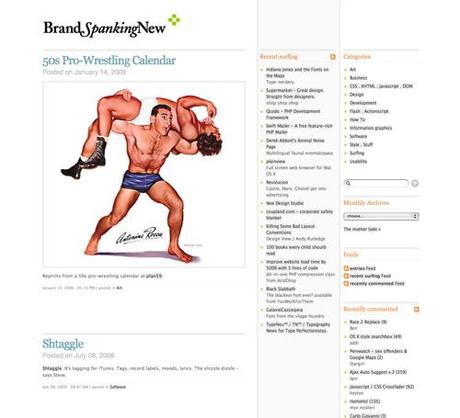
Brand Spanking New
A black and white color scheme with gray, orange, and pale blue accents.
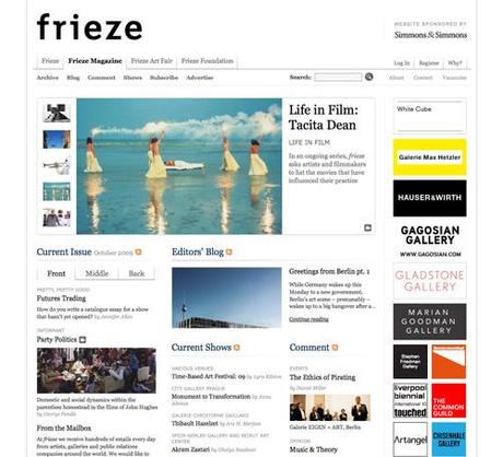
Frieze Magazine
A minimalist grid design.
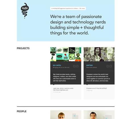
Indie Labs
A dark gray, white and sky blue grid-based design.
Rikcat Industries
An entirely black and white design.

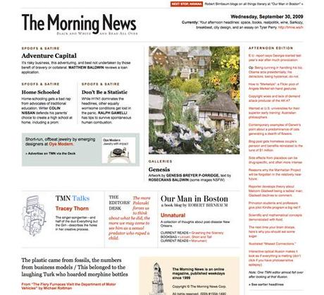
The Morning News
A minimalist magazine-style site.
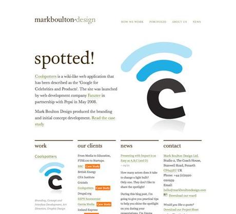
Mark Boulton Design
A mostly black and white site with colored accents.
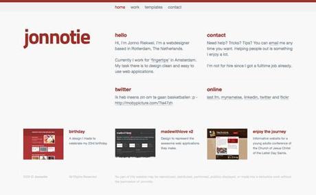
Jonnotie
A gray and maroon design.
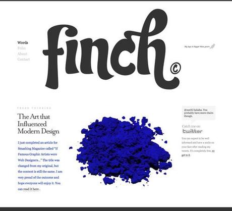
Finch
A mostly black, white and gray design.
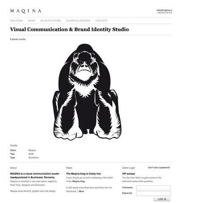
Maqina
A single column portfolio site.
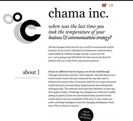
Chama Inc.
A simple black and white design with an emphasis on typography.
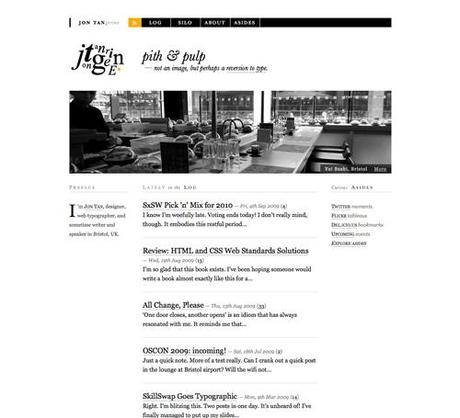
Jon Tan
Another simple black and white design with orange accents and great typography.
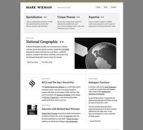
Mark Wieman
Gray and White with mustard-yellow accents.
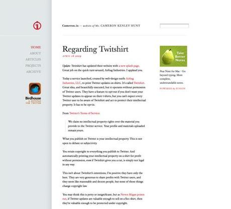
Cameron.io
A simple dove gray and white design with red accents.
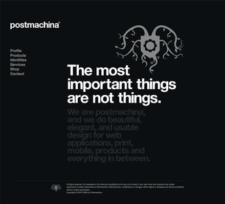
Postmachina
Black background with gray and white text.
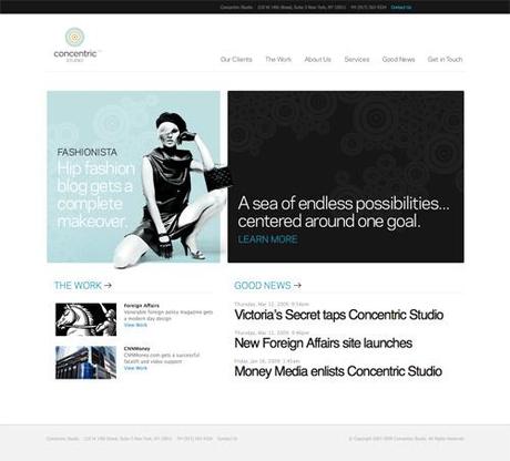
Concentric Studio
A simple design with a lot of white space.
DS.Emotion
A simple design that makes good use of drop shadows and red accents.

Kyle Sollenberger Design
Uses a soft color palette and slightly oversized text.

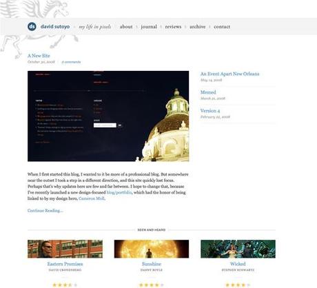
David Sutoyo
A soft gray, white and dark blue design.
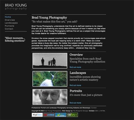
Brad Young Photography
A dark background with soft gray and blue typography.
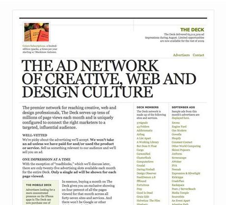
The DECK
A black and white design with strong typographical elements.
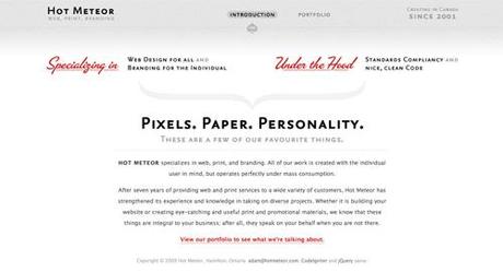
Hot Meteor
A simple design with retro elements.
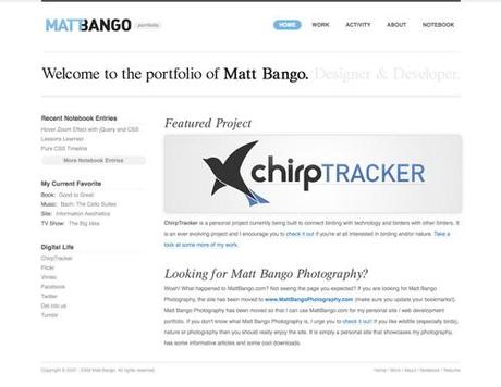
The Portfolio of Matt Bango
Another simple design with blue accents and an emphasis on typography.
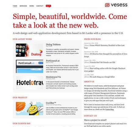
Vesess
Another black and white design with gray and red accents.
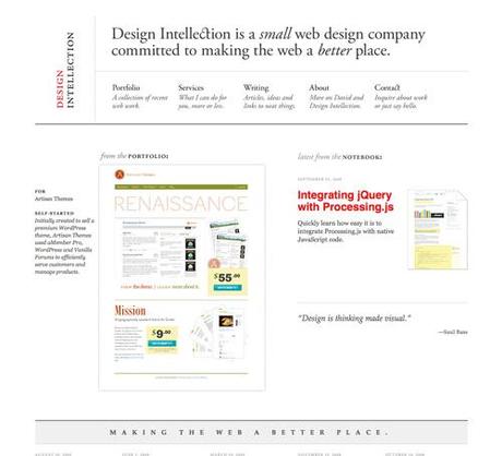
Design Intellection
A grid-based design with excellent typography.
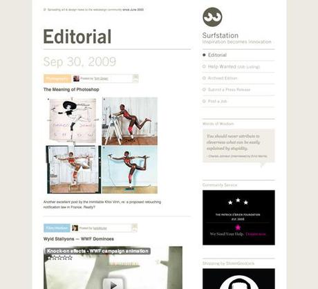
Surfstation
A soft color palette and a two-column design with lots of white space.
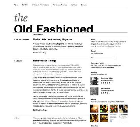
The Old Fashioned
A black and white grid-based design.
CRW / Corporate Risk Watch
Uses a textured background and some hand-drawn elements.

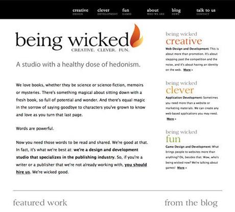
Being Wicked
A mostly black and white design with oversized typography.
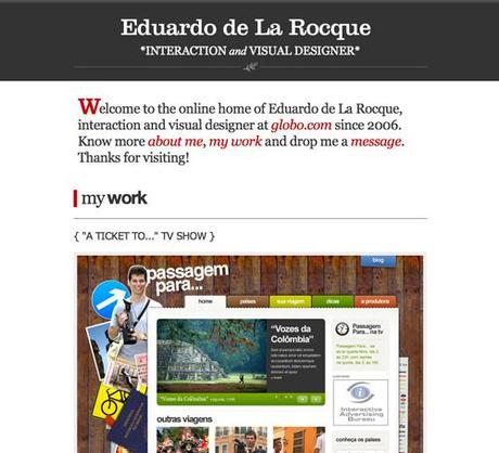
Eduardo de La Rocque
A dark gray and white, single column design.
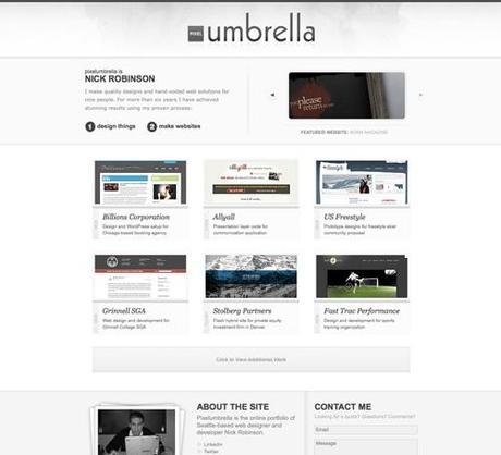
Pixelumbrella
A rarely-seen minimalist grunge design.
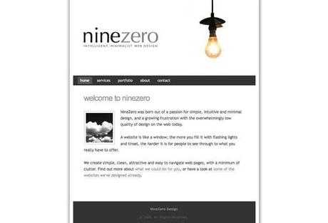
NineZero
A narrow, single-column design with a lot of white space.
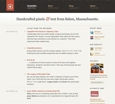
SimpleBits
A simple design with a textured header and a focus on typography.
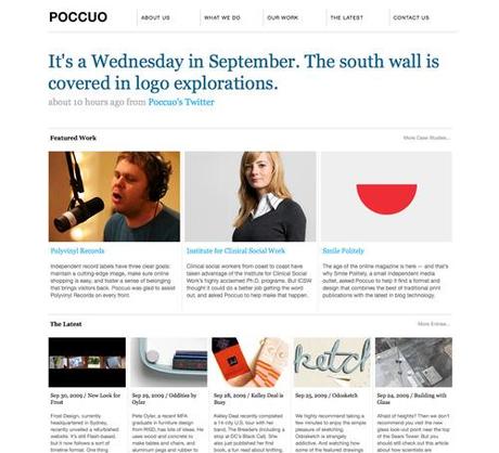
Poccuo
A grid-based design with blue, gray and black text.
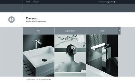
Davroc Interiors
A design composed entirely of shades of bluish-gray.
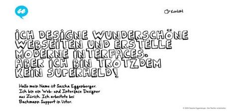
Sascha Eggenberger
Hand-drawn elements in black and white with blue accents set this design apart.
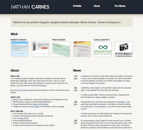
Nathan Carnes
A subtle color scheme and textures with black and gray typography.
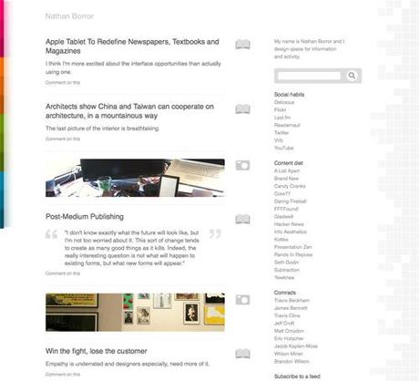
Nathan Borror
Makes use of colored and geometric accents while still retaining plenty of white space and a simple design.
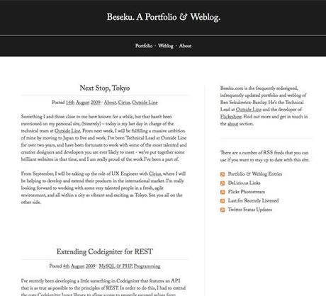
Beseku
A black and white design with an emphasis on typography.
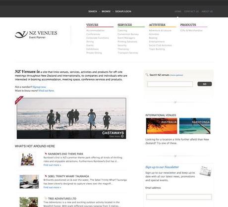
NZ Venues
A subtle dark gray and white design with small, multi-colored accents.
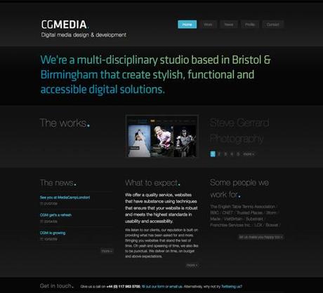
Chris Garrett Media Ltd
A dark design with subtle gradients in the typography and blue accents.
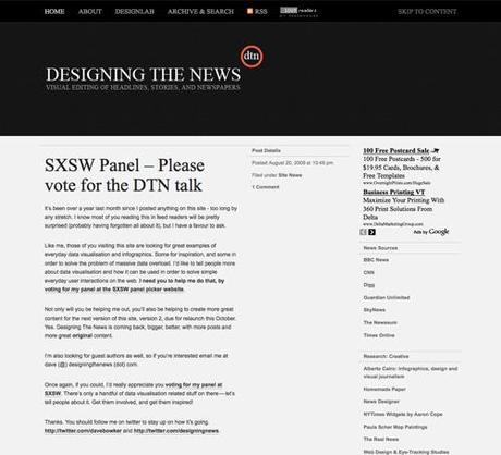
DesigningTheNews.com
A black and gray design with a focus on typography.
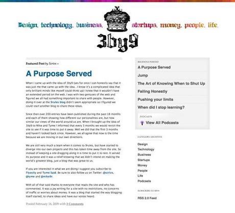
3by9
A multi-colored minimal design with colorful accents and lots of white space.
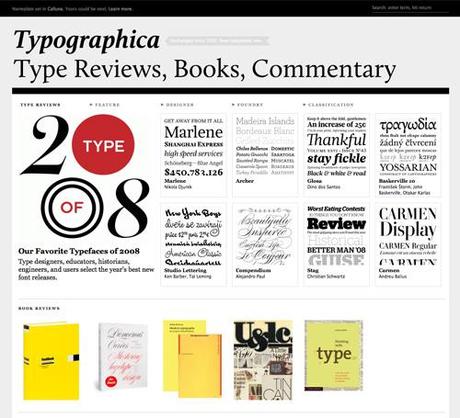
Typographica
A black, white, and gray design that places emphasis on the images it displays and uses a grid-based design.
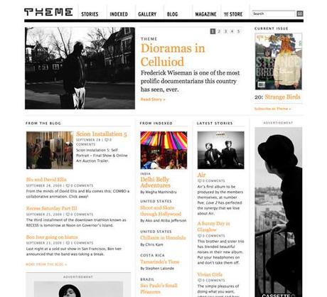
Theme
A magazine/grid-style design with orange accents.
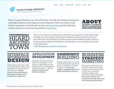
Monty Lounge Industries
A blue and gray design with an emphasis on typography.
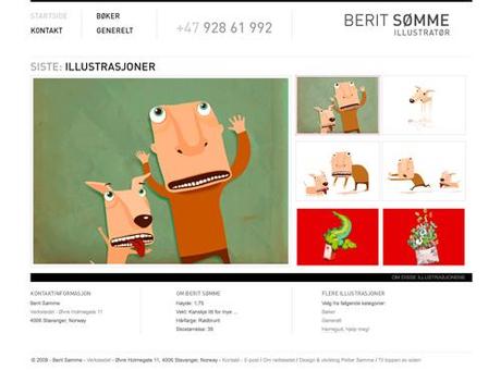
Berit Somme
A black, white and gray design that places the emphasis on the portfolio pieces.
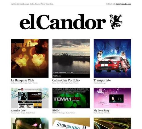
el Candor
A black and white grid-based portfolio site.
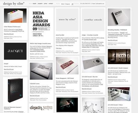
Design by Silnt
A grid-based design in shades of gray.
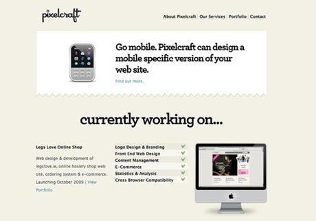
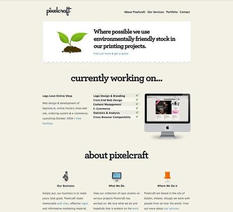
Pixelcraft
A cream-colored background and black typography keep things simple.
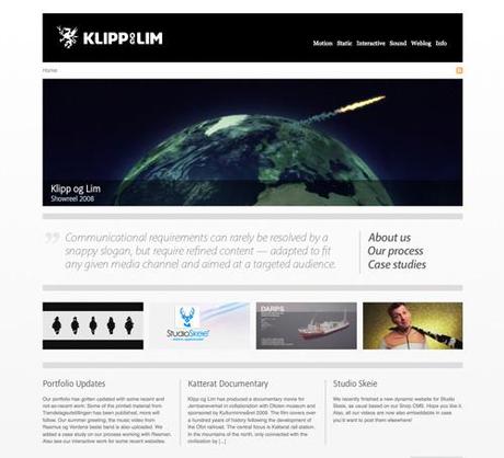
Klipp og Lim
A grid-based design with a portfolio slideshow in the header.
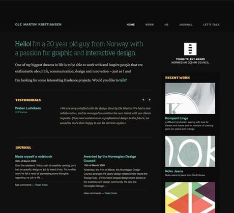
Ole Martin Kristiansen
A dark background with subtly-colored typography.
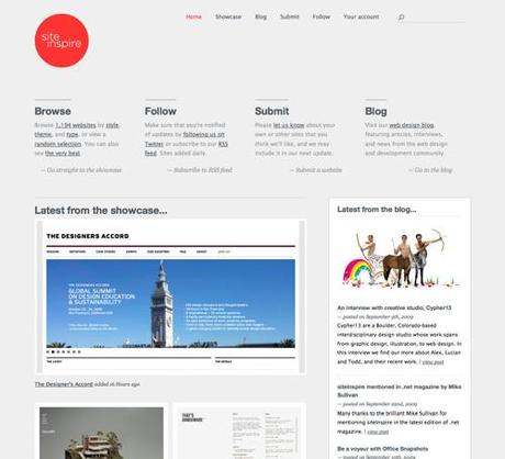
SiteInspire
A gray site with bright red accents.
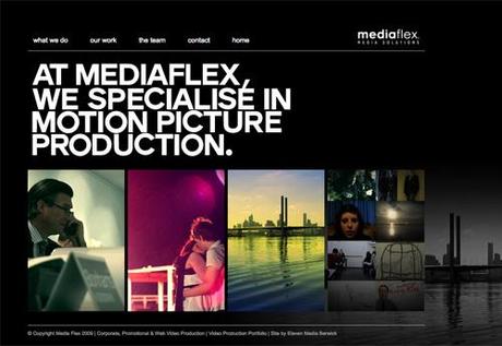
MediaFlex
A dark background with white typography that leaves the emphasis on the images.
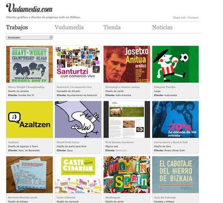
Vudumedia
A black, gray and white grid-based design.
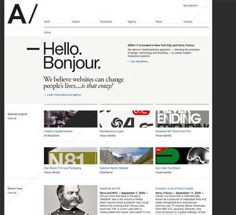
AREA 17
A black, white and gray design with some dark blue typography.
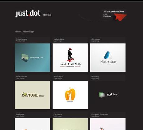
just.dot
A grayish-brown background and a grid-based design.
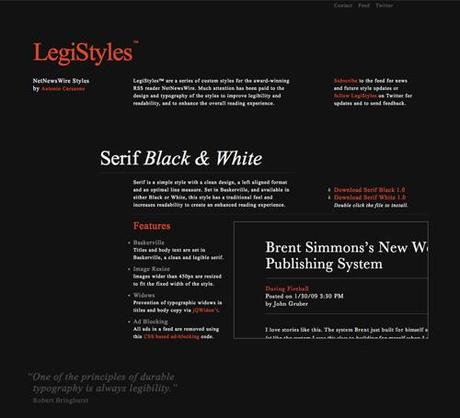
LegiStyles
A dark background with an emphasis on typography and tomato-red accents.
Visualbox
A subtly-patterned dark-gray background with bold white and gray typography.

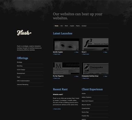
Flush
A dark gray, slightly-grungy design.
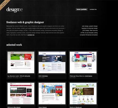
Designme
A dark background with gray and white typography.
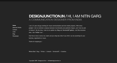
Designjunction.in
A dark background with lighter typography.
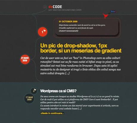
deCode
A dark, textured background with hand-drawn elements and a bit of a retro vibe.
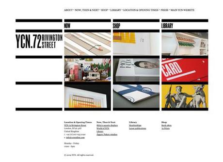
72 Rivington Street
A bold, black and white grid design.
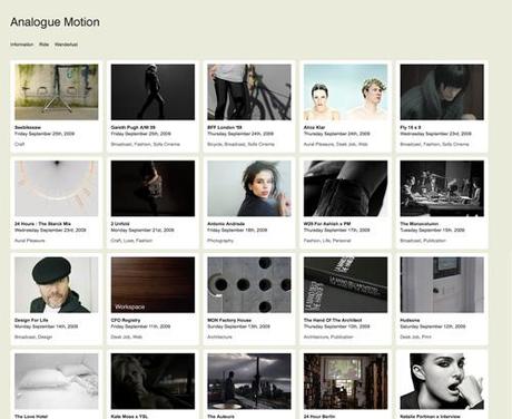
Analogue Motion
A grid-based design with a subtle color palette and typography.
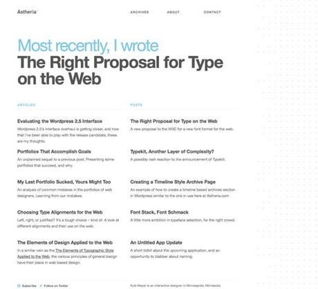
Astheria
A subtle blue, gray and white design with plenty of negative space.
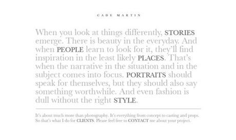
Cade Martin Photography
A white and gray design with the emphasis on the typography.
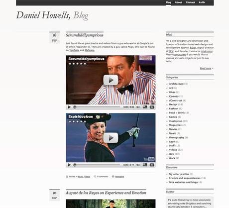
Daniel Howells
A subtle design that focuses on the typography.
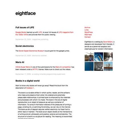
Eightface.com
A black and white design with red highlights.
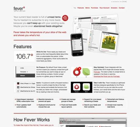
Fever
A gray background with gray and red text.
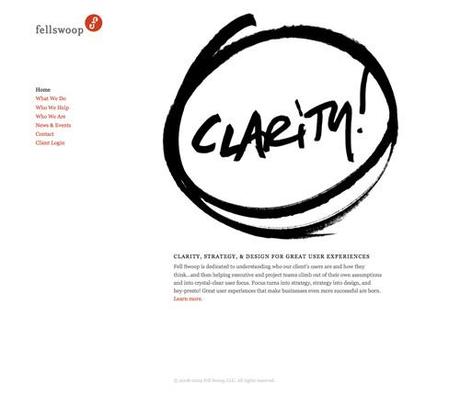
Fell Swoop
A white background with black and red typography and tons of negative space.
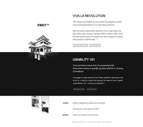
FRKT
A black and white design with subtle textures.
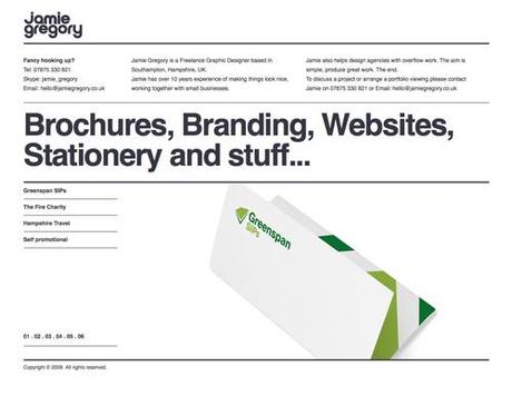
Jamie Gregory
A grid-based deisgn that focuses on typography.
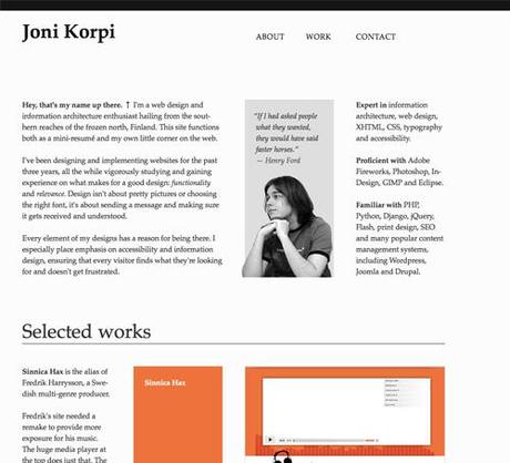
Joni Korpi
A gray and black design with an emphasis on typography.
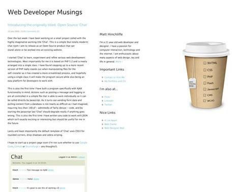
Matt Hinchliffe
A black and white design with light blue accents.
Martin Hipp
White background and green accents.

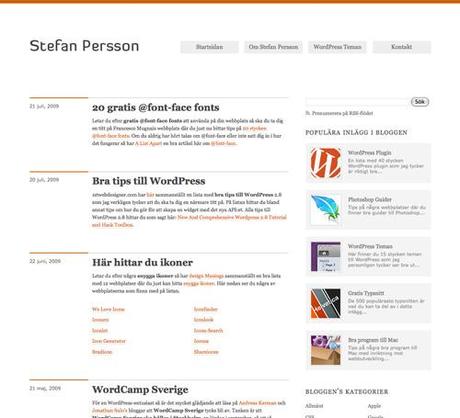
Stefan Persson
A grid-based design with orange accents.
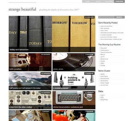
Strange/Beautiful
A gray and white grid-based design.
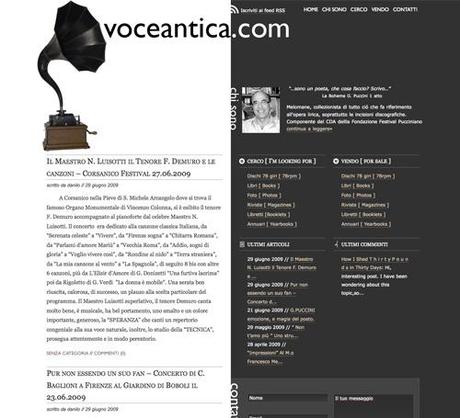
Voce antica
A white and gray two-column design.
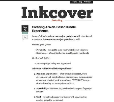
Inkcover Blog
A black and white design with oversized typography.
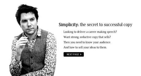
Allday.cc
A very simple black and white design with minimalist navigation.
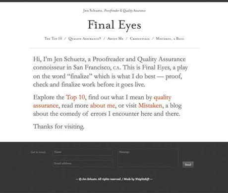
Final Eyes
A black, white and gray single-column design.
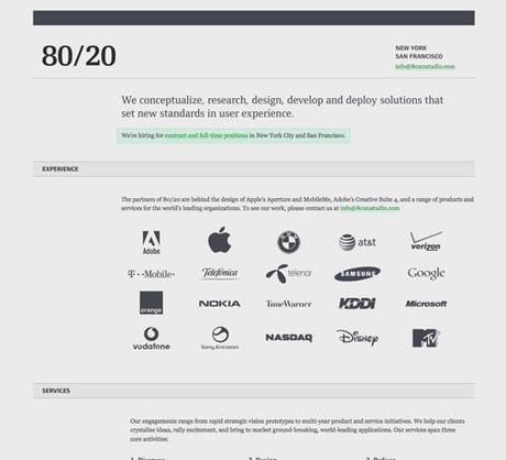
80/20
A gray color scheme with green accents.
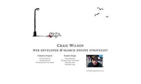
Craig Wilson
A very simple black and white design with hand-drawn elements.
Pomade
An extremely minimalist design with black text and red accents.
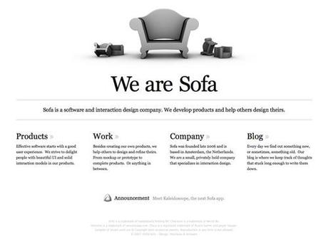
SOFA
A grid-based design that emphasizes typography.
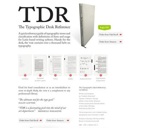
The Typographic Desk Reference (TDR)
A minimalist sales page that utilizes modal windows.
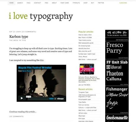
I love Typography
A simple design with olive green typography accents.
Artypapers
A white background and subtle gray and pink color scheme.

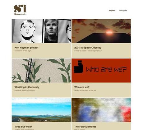
Sisson Studio
A brown and tan grid-based design with a white background.
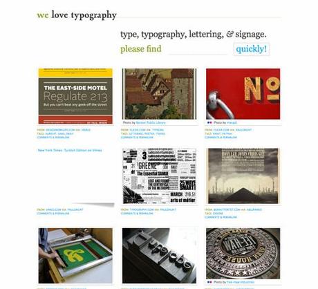
We Love Typography
A grid-based design with a white background.
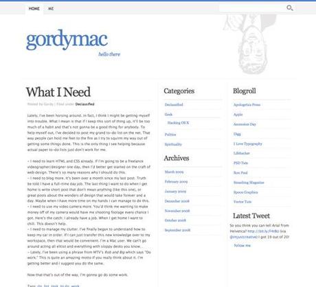
Gordymac
A blue and gray design with plenty of white space.
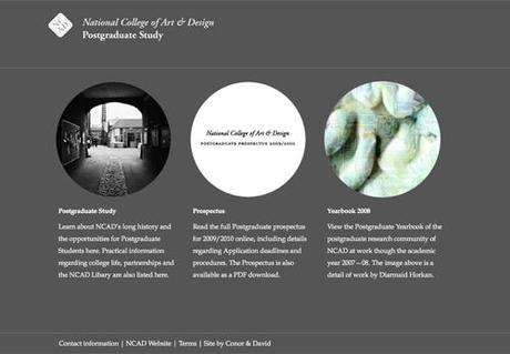
National College of Art & Design: Postgraduate Study
A gray design with circular images and white text.
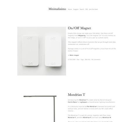
Minimalissimo
Black and gray typography with plenty of white space.
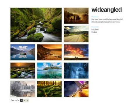
Wide Angled
A grid-based site that puts the emphasis on the images it features.
Hair Ott
A gray, black and white design with a Flash slideshow in the header.

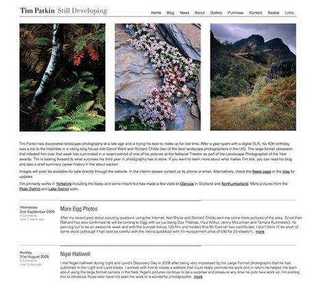
Tim Parkin
A grid-based design with a white background.
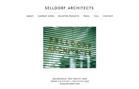
Selldorf Architects
A simple black and white design.
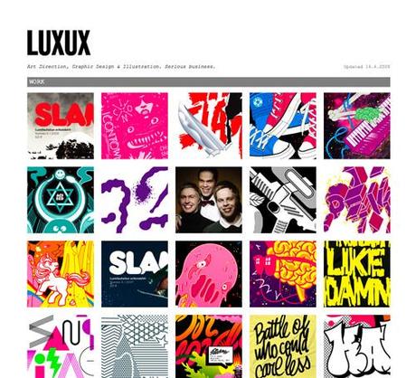
LUXUX
A grid-based portfolio site.
Fluid
A grid-based design with a white background and simple typography.

Saturday
A simple design with a Flash slideshow.

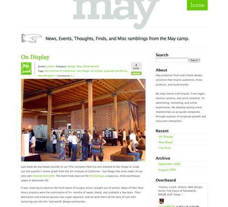
The May Blog
A simple gray and green color scheme on a white background./p>
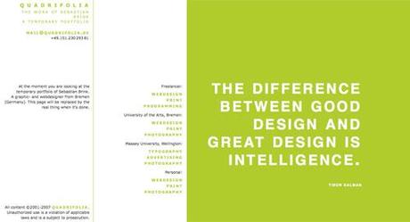
quadrifolia
A very bold green and white design.
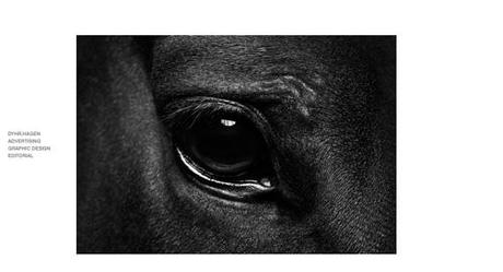
Dhyr.Hagen
A bold gray and white design.
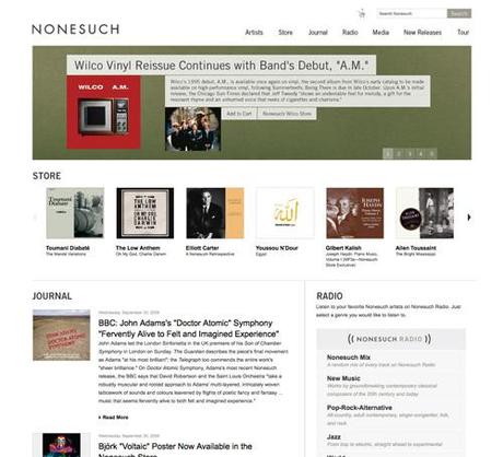
Nonesuch Records
A simple black and white design with an emphasis on imagery.
About Author – Cameron Chapman is a professional Web and graphic designer with over 7 years of experience. She writes for a number of blogs, including her own, Cameron Chapman On Writing. She’s also the author of Internet Famous: A Practical Guide to Becoming an Online Celebrity.
