Breadcrumb navigation is often overlooked in the design and development process. Some people may see it as unnecessary while others may feel it is too big of a hassle for what its worth. Fact of the matter is, breadcrumb navigation will greatly increase the usability of a website. Breadcrumbs give users an alternative method of navigation, allow them to see where they stand in the hierarchy of a website, and will reduce the number of steps needed to navigate to a higher-level within a website.

Outlined here are the different types of breadcrumb navigation being used today, why they are important, and how they should best be implemented online. Also included here for your reference are over 30 examples of how breadcrumbs are being used online today. Remember, while it is likely that breadcrumb navigation will not make or break a website it will provide an added benefit to your users by increasing the overall usability and functionality of your website.
Breadcrumb Types
Path
Path-based breadcrumbs indicate the steps, or path, a user has taken to arrive at the current page of a website. Furthermore, users will see links to pages they have previously visited to reach the current page. Out of the three types of breadcrumb navigation, Path-based breadcrumb navigation is least popular online. Reason being, Path-based breadcrumb navigation provides the similar functionality to the “Forward” and “Back” buttons on a browser. For most websites Location-based and Attribute-based breadcrumb navigation offers better functionality.
Location
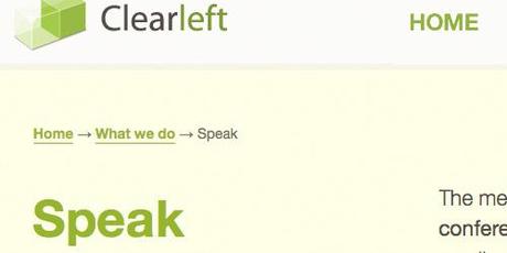
Location-based breadcrumbs indicate to the user where the current page stands in the hierarchy of the website. This type of breadcrumb navigation is most commonly seen on websites with more than two levels of depth or content. Upon moving further into a website users are provide with links to pages, or categories, that act as a “parent” or a level up from the page they are currently viewing. For example, a user may be on the “Speak” page however the “What we do” page is a parent of the “Speak” page while the “Home” page is a parent of the “What we do” page.
Clearleft Ltd

Attribute
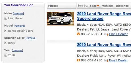
Attribute-based breadcrumbs indicate to the user the attributes or categories ascribed to the current page within a website. Often seen on e-commerce websites, products may not only fall under a category but under certain attributes as well. For example, a vehicle may be categorized as an SUV then have the attributes of being the color black and released in the year 2010.
Cars.com

Why Use Breadcrumbs?
- Great Usability
Breadcrumbs provide an additional means by which users can easily navigate a website. If a user lands on an internal page on your website from another source breadcrumbs will allow the user to see exactly where they stand within the sites hierarchy. User are also given the opportunity to move up to a higher level of the website at any given time without any hassle. - Easy to Backtrack
Primary navigations are not designed to be followed backwards were breadcrumbs are. Since backtracking is extremely popular online providing a little additional help can go a long way. - Eliminate Additional Clicks
Breadcrumbs allow users to jump from one level of a website to the next without having to use the “forward” or “backward” buttons on the browser. Additionally breadcrumbs eliminate the need for users to continually resort to the main navigation. - Shows Users Hierarchy
The primary navigation of a website will not reflect the hierarchy of every page within the site. Giving users breadcrumbs will allow them to see the hierarchy of a page within a website. - Visually Pleasing
Not only do breadcrumbs provide users with additional usability, they do so without taking up much room or space on the page. Breadcrumbs are easy to implement into the visual design of your website and provide a great benefit to users. - Provides Additional Help
It is entirely possible that some users may not understand how a websites primary navigation works and in some cases users may not even know what they are looking for. Giving users breadcrumbs will allow them to see the overall progress and structure of a website thus allowing them to navigate the website better. - Lower Bounce Rates
Typically breadcrumbs will provide a more detailed navigation than the primary navigation. In doing so, users will be given more options on how to navigate a website. Giving them the opportunity to easily back track a few levels within the website will lower your bounce rate. - Builds Interest
When a user lands on an internal page of a website odds are they are already on a page of interest. Breadcrumbs may provide links to additional pages and information of which the user is also interested in without making them start from square one.
Breadcrumb Best Practices
- Use Breadcrumbs at the Top of a Page
The most common and instinctual placement for breadcrumbs is within the top of a page. This allows users to find the breadcrumbs in an uncomplicated manner and make use of them accordingly. - Use Breadcrumbs Consistently
If you do decide to use breadcrumbs make sure that you use them across your entire website. Giving users breadcrumbs on some pages and not others will only confuse and frustrate them. (One prime example of this is Amazon as they remove breadcrumbs from the individual product pages.) - Breadcrumbs Should Degrade Gracefully
Breadcrumbs should always start with the home page and degrade to the currently page. In doing so your breadcrumbs need to go from the highest level to the lowest level one step at a time. - Stylize Breadcrumbs Appropriately
You want your breadcrumbs to be seen however you do not want them to be the focal point. You also want to make it apparent that your breadcrumbs are not part of the main content to a page, only additional support to it. Find a happy medium where your breadcrumbs are noticeable however not overbearing. - Categorize Pages Clearly
If you have pages that fall under two or more categories you may not want to use breadcrumbs on your website. Trying to place a page under two or more categories will likely only produce unclear breadcrumbs and puzzle the user. Make sure your website has an organized hierarchy and is displayed accordingly through your breadcrumbs. - Clearly Separate Each Level
Make sure users are able to distinguish the difference between each breadcrumb level. The most common separator between levels is the ‘greater than’ character (>). Other good separators include right double angle quotations (»), slashes (/), and arrows (→). If using a plain text character, only use one. (» is more appealing and effective than >>) - Single Out the Current Page
Use a different style on the last item of a breadcrumb list to establish that it is the currently page being viewed. You can accomplish this by making the item bold, changing its color, or emphasizing it. - Do Not Make the Current Page a Link
There is no need to make the last item of a breadcrumb list a link because it is the current page being viewed. Creating a link here will only confuse users, especially when they click on it and are not taken to a new page. - Do Not Use Breadcrumbs as a Page Heading
Using the last item of a breadcrumb list as the heading of a current page is ineffective. If you choose to use breadcrumbs do so with the addition of a page heading as well. - Breadcrumbs Do Not Replace Primary Navigation
Breadcrumbs are only to be used as support to the primary navigation, never to replace the primary navigation altogether. You should always provide users with a primary navigation from which they can navigate a website before using breadcrumb navigation.
Great Examples of Breadcrumbs
Vitra Direct

Trek Bikes

Illy

SiteInspire

Mia and Maggie

Intridea

Design by Humans

Roxy

Blik

SitePoint

Target

Walmart

1-800-Flowers

BestBuy

Amazon.com

Barns & Noble

Lands’ End

Apple

Google

Chase

AbsolutePunk.net

Littman Bros. Lighting

Guardian.co.uk

AREA 17

Wufoo

Girl Scouts of Middle Tennessee

The Glasgow Collective

Firstborn

Bell Canada

Grooveshark

Devlounge

About Author – Shay Howe is a professional web and user interface designer currently living in Chicago, IL. He writes about web design in his own blog over at letscounthedays and would love to hear from you on Twitter. Please feel free tell him hello!
