>> The Challenge:
It is extremely rare that the size of a part happens to conveniently fit the size of paper that we have available for printing. It therefore becomes necessary to scale things up or down as appropriate to suit. Hmmm, that sounds vaguely familiar; it must be that déjà vu thing again…
>> The Reality:
As we saw in the previous tip, everything should always be drawn full size. We then set the scale factor when we print in order to make things fit the available paper. The problem is that text, dimensions, hatch patterns, and non-continuous line types also get scaled up or down; and as a result, don’t print to the correct size.
>> The Solution:
The previous tip said that there were two possible solutions to the problem of properly scaling annotation entities. It then went on to detail the first case wherein these entities are created in model space, and are either bigger or smaller than the desired final size so they come out correctly when the overall drawing is printed to a specific scale.
All drawing and annotations in early CAD systems were done this way simply because there was no other space. Later, paper space was introduced. The intent was that model space would contain the “model” of the object being drawn, while all documentation and annotation, the things that appear on paper but not on the actual object, would be placed in paper space.
In this article we will learn how to apply annotation entities in paper space layouts. We will then compare the model space versus paper space techniques, exploring the advantages and disadvantages of each.
Spaced Out…
The easiest way to explain the paper space method of applying dimensions and text is to work through a simple example. Your results may differ a bit because I wanted to increase clarity so the examples use layers that I created with suitable colors. I switched the default text to a prettier font. And, I reduced dimensions to having no decimal places.
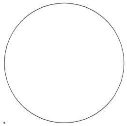
- Step 1: Start by drawing a circle with its center at 0,0 and with a radius of 0.5 units.
- Step 2: Draw another circle with its center at 50,50 and with a diameter of 50 units.

Figure 1: A Simple Drawing of a Large Circle and a Small One.
- Step 3: Click on the Layout 1 tab to switch to a paper space layout.
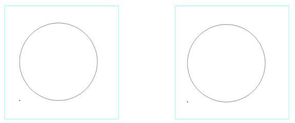
Start the MVIEW command and a model-space viewport with its first corner at 0,0 and its opposite corner at 2,2. - Step 4: COPY the first viewport by using a base point of 0,0 and a displacement point of 3,0. That’s right; a viewport is simply another type of entity. You can copy, move, resize, assign it to a specific layer, and delete it. A viewport on a frozen layer won’t display or print but still shows everything within it.

Figure 2: Two Paper-Space Layouts Have Been Created.
- Step 5: Double-click inside the left viewport in order to reach through into model space.
- Step 6: Pan and zoom until the small circle is approximately centered in the viewport and is about half the size of the viewport.
- Step 7: Double click outside of either viewport in order to return to the paper space layout.
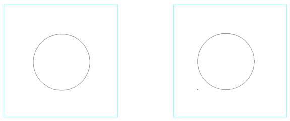
- Step 8: Double click on the side of the left viewport to bring up the Entity Properties dialog box. Set the scale to 1.0 and click OK.
- Step 9: Double click on the side of the right viewport to bring up the Entity Properties dialog box. Set the scale to 0.01 and click OK.

Figure 3: The Left Viewport Shows the Small Circle at a Scale Factor of 1, while the Right Viewport Shows Both at 0.01.
Now comes the fun part.
- Step 10: Start the TEXT command and add the scale notes to each viewport. Note that they are located within the viewport boundary but do not double click first. We want to stay in paper space.
- Step 11: Start the DIMDIA command and place diametric dimensions on all three circles.

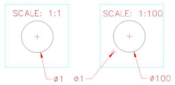
Figure 4: Text and Dimensions have been Applied in the Paper-Space Layout.
Let’s look at the implications of what we just did. In particular, note the two Ø1.0 dimensions. They have both been applied to the same circle and they give the same value. In addition their text, extension lines, and arrowheads are the same size and yet the right-hand viewport is scaled 100 times larger. Unlike the model space method of dimensioning, we didn’t have to set a different DIMSCALE factor for the two dimensions. Similarly, the two text notes simply have the standard text height.
By the way, entity snaps work when reaching through a viewport to attach dimensions.
This paper space layout can now be printed at a simple 1:1 scale and everything comes out correctly. We didn’t have to do any scale calculations nor did we have to fiddle with any text or dimension sizes.
Counting Your Hatches…
Okay, I lied a little bit about not doing any calculations. Hatching and non-continuous lines are still placed in model space, so their scale factors have to be set as covered in my previous article.
>> Notes to You:
Now that we have seen both methods of annotating scaled drawings, let’s look at the pros and cons of each method.
Model space:
- Pro:
- Dimensions are visible in model space while we are editing the model.
- Dimensions can be stretched and moved along with their target entities.
- Con:
- Calculations are required and different values are needed for each printing scale.
- Relatively messy to handle details at different scales within the same drawing. Hmmm, that sounds like a good topic for a future tip…
Paper Space Layouts:
- Pro:
- Calculations are not required and different values are not needed for each printing scale.
- Easily handles details at different scales.
- Con:
- Dimensions are not visible in model space while we are editing the model.
- If target entities are moved or stretched, then dimensions must be moved, deleted and re-applied, or stretched to suit.
So what is the bottom line? The best solution is probably a bit of mixing and matching.
- Dimensions should stay in model space for editing convenience, except perhaps for details at other scales.
- General text notes, borders, and title blocks should live in paper space layouts.
>> Command review:
- Paper Space Layouts:
- Keyboard: MVIEW
- Menu: View > Layout Viewports
- Toolbar: Layouts > Layout Viewports
- Alias: MV

